
By the end of this guide, you'll have a contact form that actually gets filled out - not one that looks cool on Dribbble but sits there collecting dust on your real website. We're talking about contact form conversion: the percentage of visitors who land on your page and actually hit "Send."
The popular advice right now says to use multi-step forms, chatbot widgets, or slide-in pop-ups that trigger after 30 seconds. Those approaches have their place. But for most small business sites - plumbers in San Jose, wedding photographers in Palo Alto, dog groomers in Fremont - there's a quieter pattern that consistently outperforms: a single, visible, above-the-fold form with three to five fields. No steps, no animations, no waiting.
Here's how to set it up, and why it works.
What You Need Before Starting
- A website you can edit (WordPress, Squarespace, custom HTML - doesn't matter)
- Google Analytics 4 installed, with event tracking enabled (this DataDrivenInvestor piece covers what most owners miss during setup)
- A working email address or CRM where submissions land
- 20 - 40 minutes of focused time
Step 1: Pick the Right Page - and Put the Form Above the Fold
Most businesses bury their contact form on a dedicated "/contact" page that visitors have to hunt for. That's fine as a backup. But your highest-traffic page - usually your homepage - should have the form visible without scrolling.
"Above the fold" means the portion of the page a visitor sees before they scroll. On desktop, that's roughly the top 600 - 800 pixels. On mobile, it's even less - maybe 500 pixels.
Place your form in the right half of the hero section (desktop) or directly below a one-line value proposition (mobile). The visitor should see it within one second of landing.
Common mistake: Putting a "Contact Us" button above the fold that links to a separate page. Every extra click is a place where people leave. The form itself needs to be visible, not a link to it.
Step 2: Reduce Fields to the Minimum That's Actually Useful
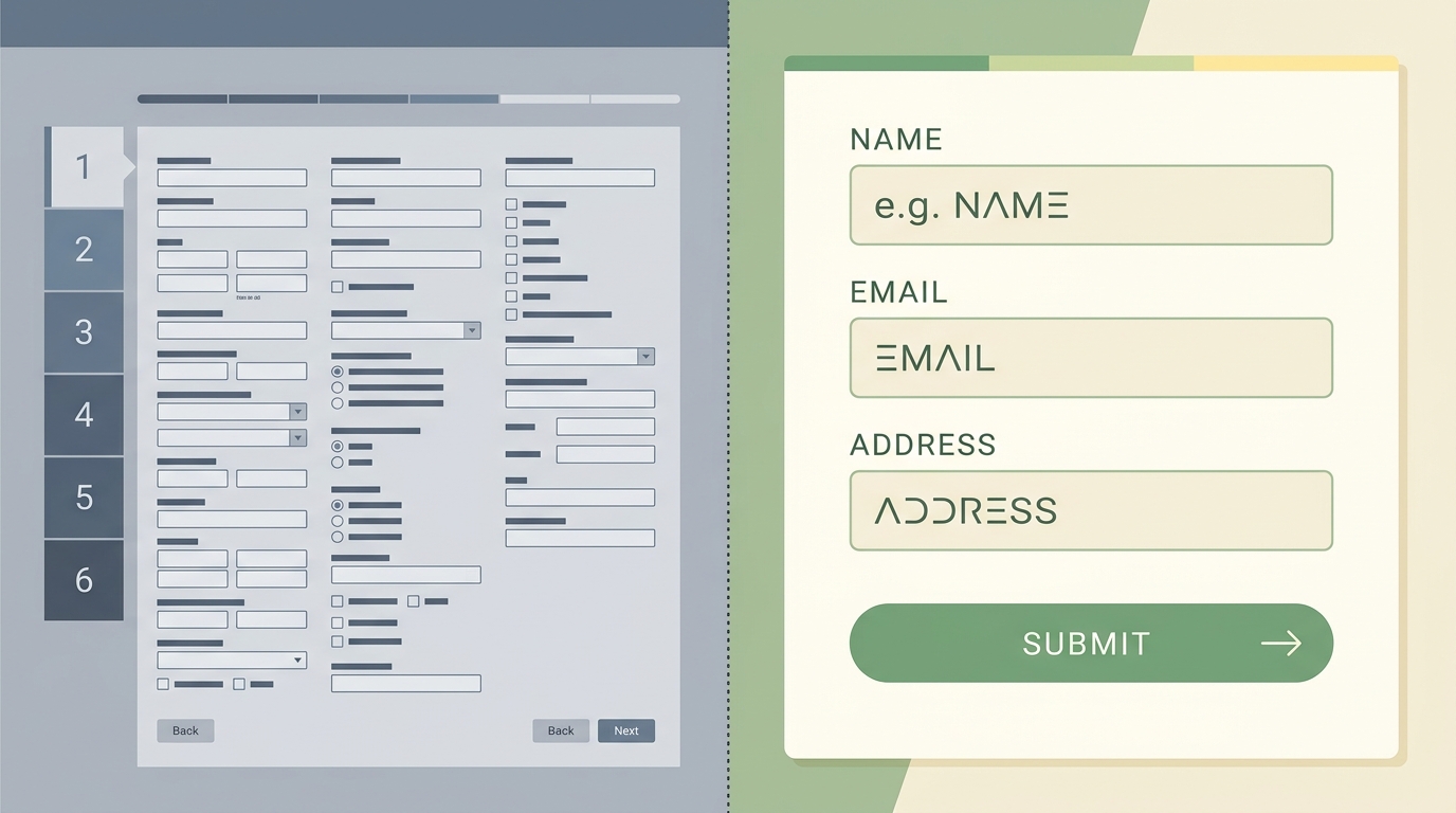
- 3 fields (name, email, message): baseline conversion rate
- 5 fields: roughly 15% fewer submissions
- 7+ fields: 30 - 40% fewer submissions
For a local electrician or a mobile pet groomer, you need three fields: name, phone or email, and a short message box. That's it. You don't need their address, company name, budget range, or how they heard about you. You can ask all of that on the first phone call.
Tip: If you absolutely need more info - say you're a contractor who needs to know the project type - use a single dropdown instead of a text field. Dropdowns are faster to complete and don't trigger the "this looks like a lot of work" response.
Step 3: Write a Headline That Answers "Why Should I Fill This Out?"
The form itself needs a headline. Not "Contact Us" - that's a label, not a reason. Try something that states what happens next:
- "Get a free quote within 2 hours"
- "Describe your project - I'll reply by tomorrow morning"
- "Quick question? I respond same-day."
The headline does two things: it sets an expectation (they'll hear back quickly) and it lowers the perceived commitment (this isn't a binding contract, it's a conversation starter).
I built a site last year for a Sunnyvale-based tax prep firm - the original "Contact Us" form got maybe two submissions a week. We changed the headline to "Send your tax question - I'll reply within 4 hours" and kept everything else identical. Submissions went to nine per week. Same form, same fields, same placement. Just a better headline. That's contact form conversion in practice: small changes, measurable results. You can see similar work at autom84you.com/pages/portfolio.php.
Step 4: Make the Submit Button Specific
"Submit" is the default button text on nearly every form builder. It's also vague and slightly clinical - like you're filing paperwork.
Change it to match your headline:
- "Get My Free Quote"
- "Send My Question"
- "Request a Callback"
This is a small detail, but A/B tests consistently show that specific button text outperforms generic "Submit" by 10 - 20%. The button is the last thing someone reads before deciding to click. Make it reinforce what they're getting.
Step 5: Add a Trust Signal Next to the Form
Right below or beside the form, add one trust element. Not five - one. Options:
- A single client testimonial (2 - 3 sentences, with a name and business type)
- "Trusted by 200+ Bay Area homeowners" or similar specific claim
- A Google Reviews badge showing your rating
- "No spam. I reply personally." - works surprisingly well for solo operators
The reason this matters: visitors who are about to fill out a form on a site they've never visited are making a small trust decision. One well-placed proof point can tip the balance. Loading up five logos and three testimonials creates visual noise that actually hurts contact form conversion - it makes the area around the form feel cluttered and harder to scan.
Step 6: Set Up a Proper Confirmation - Not Just "Thanks"
After someone submits the form, what happens? If the answer is a generic "Thank you for your submission" message, you're wasting a moment of high engagement.
The confirmation should:
- Tell them exactly when you'll respond ("I'll email you within 2 hours during business days")
- Give them something useful while they wait - a link to your FAQ, a pricing guide, or a relevant blog post
- Optionally, let them book a call directly if they want faster service
This isn't just polite - it reduces the "did my form actually go through?" anxiety that causes people to submit twice or call your office to confirm.
Step 7: Track It So You Know What's Working
If you're not tracking form submissions as events in GA4, you have no idea whether your contact form conversion rate is 1% or 10%. Both are common. The difference between the two is usually the six steps above.
Set up a GA4 event that fires on successful form submission. If you're on WordPress, most form plugins (WPForms, Gravity Forms, Contact Form 7) can do this with a plugin or a small snippet of code. If you're on a custom site, it's a few lines of JavaScript on the confirmation page or success callback.
Once you're tracking, check the numbers weekly for the first month. You're looking for:
- Form view rate: What percentage of page visitors actually see the form? (If it's below 60% on your homepage, it's not above the fold.)
- Completion rate: Of those who start filling it out, how many submit? (Below 50% means too many fields or a confusing layout.)
- Submission-to-reply rate: How quickly are you responding? This isn't a website metric, but it directly affects whether form leads turn into customers.
Why This Beats the Trendy Approach
Multi-step forms - the ones that show you one question at a time with a progress bar - have become very popular in the last two years. Tools like Typeform and multi-step add-ons for WordPress push this pattern hard. And for certain use cases (long applications, complex quoting), they genuinely help.
But for a local business that just needs someone's name and question? Multi-step forms add friction where none is needed. They turn a 15-second interaction into a 45-second one. They look sophisticated, which is why designers love them. But contact form conversion data for simple service businesses consistently favors the single-view form.
Same story with chatbot widgets. They're useful when you have a large catalog or complex routing needs. For a solo CPA or a two-person landscaping crew, a chatbot that asks "How can I help you today?" just adds a layer between the visitor and the actual human they want to reach. If you're interested in AI chatbots for situations where they genuinely make sense - like handling after-hours questions with answers trained on your actual service data - that's a different conversation, and autom84you.com is where I build those. But a chatbot is not a substitute for a good form.
What to Do Next
If you already have a contact form, run through steps 1 - 6 against what you currently have. Most sites I audit fail on at least three of them - usually placement, field count, and the headline.
If you're building from scratch, start with a simple HTML form or a lightweight plugin. Don't reach for the most feature-rich option first. A three-field form that loads in under a second will outperform a feature-heavy builder that adds 200KB of JavaScript to your page.
Give it two weeks of tracking before you change anything else. Contact form conversion improvements are cumulative - each fix builds on the last - but you need a baseline before you start tweaking.
If you want someone to look at your specific setup and tell you where the drop-off is happening, send the URL to nerd@a84y.com. I'll give you an honest read - sometimes the popular approach really is the right one for your situation, and I'll say so. Other times, the fix is a 20-minute change that doubles your leads. Either way, you'll know. - Rishi, autom84you.com


Comments
No comments yet. Be the first to share your thoughts!
Leave a Comment