
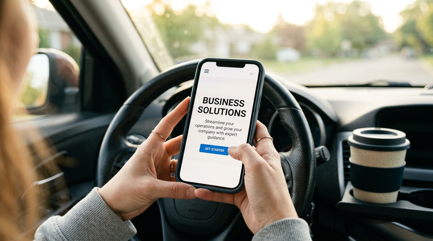
I once spent forty-five minutes choosing a Netflix movie, then watched the first twelve seconds of the one I picked and switched to something else. We are all monsters. And your landing page small business visitors? They're worse. They give you about three seconds before they hit the back button and return to whatever TikTok rabbit hole they crawled out of.
Here's what this guide gets you: by the end, you'll have a dead-simple above-the-fold layout for your landing page that converts better than the trendy full-screen-video-parallax-animated-gradient nonsense that design Twitter keeps pushing. We're talking the boring pattern. The one that works.
What You Need Before Starting Your Landing Page Small Business Makeover
Not much, honestly:
- Access to edit your website (if you don't have this, we have bigger problems)
- One clear photo of your work, your team, or your product - real, not stock
- The ability to describe what you do in one sentence without using the word 'solutions'
- About 90 minutes of uninterrupted time
That's it. No design degree. No $200/month page builder subscription. No 47-page brand guidelines document.
Step 1: Write Your One-Sentence Value Statement
This is the headline. The big text. The thing people read first. And here's where most small business owners mess up - they write what they think is impressive instead of what the visitor needs to hear.
Bad: 'Premium Full-Service Digital Marketing Agency Delivering End-to-End Brand Experiences'
Good: 'We get your HVAC company on page one of Google'
See the difference? One sounds like it was generated by a committee of MBAs. The other tells a specific person exactly what they get. Your landing page small business headline should pass the 'would I say this to someone at a barbecue?' test. If you'd feel weird saying it out loud to your neighbor, rewrite it.
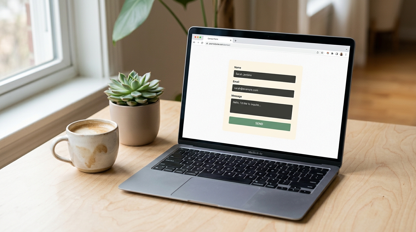
Step 2: Add One Line of Supporting Context
If your headline is 'Custom wedding cakes delivered anywhere in the Bay Area,' your subhead might be 'From tasting to delivery in 3 weeks - starting at $350.'
Price, timeline, geography, method - pick whichever removes the most uncertainty. People leave websites when they can't quickly figure out if you're even in their ballpark. Don't make them hunt for it.
Step 3: Choose One (ONE) Call to Action
This is where the trendy landing pages go off the rails. They throw six buttons at you: Book a Call, Download Our Guide, Watch the Video, Subscribe, Chat With Us, Take the Quiz. It's like walking into a restaurant where the host asks you to simultaneously choose your table, your entree, and your Spotify playlist.
One button. One action. The thing you most want visitors to do. For most service-based small businesses, that's either 'Get a Free Quote' or 'Book a Call.' For shops, it's 'Shop Now' or 'See Menu.'
Tip: Make the button text specific to the outcome. 'Get My Free Estimate' converts better than 'Submit' by a wide margin. According to Shopify's 2026 landing page statistics, personalized CTAs convert 202% better than generic ones.
Step 4: Place One Real Image (Not a Stock Photo of Handshakes)
The fastest way to make a visitor trust you is showing them something real. A photo of your actual shop. Your team on a job site. A finished project. Your food on a real plate in your real restaurant.
Stock photos of people shaking hands in front of glass buildings communicate exactly one thing: 'we couldn't be bothered to take a real picture.' Your landing page small business credibility drops the moment someone recognizes that getty-images-handshake they've seen on forty other sites.
The image goes to the right of your headline on desktop, or below it on mobile. Not behind the text with a dark overlay. Not as a full-bleed background. Next to it. Clean. Readable. Like a person standing beside a whiteboard, not in front of one.
Step 5: Add Exactly Three Trust Signals Below the Fold Line
Right at the bottom of the visible screen - before scrolling - tuck in three small proof elements. Pick from:
- Star rating + review count ('4.9 stars from 127 Google reviews')
- Years in business ('Serving San Jose since 2011')
- Number of customers or projects ('400+ kitchens remodeled')
- A recognizable certification or partner logo
- One short testimonial quote (two lines max)
Three. Not twelve. Not a scrolling carousel of logos. Three quiet confidence signals that say 'other humans have trusted us and lived to tell the tale.'
Step 6: Kill Everything Else Above the Fold
Here's the part that hurts. Everything else you currently have above the fold? The auto-playing video. The announcement banner about your holiday hours from last December. The popup asking for an email address before they've read a single word. The three navigation dropdowns with seventeen sub-items each.
Gone. All of it.
The pattern that works for a landing page small business owners actually convert on is almost comically simple: headline, subhead, one button, one image, three trust signals. That's the whole recipe. It works because it respects the visitor's three-second judgment window instead of trying to cram your entire business story into it.
Common mistake: 'But I need to explain all my services!' No. That's what the rest of the page is for. The above-the-fold job is singular: keep them from leaving. Explaining comes after they decide to stay.
Step 7: Test It on Your Phone First
Over 60% of your traffic is mobile. Pull up your landing page on your phone right now. Can you read the headline without squinting? Can you tap the button with your thumb without accidentally hitting something else? Does the image load in under two seconds?
If any answer is no, fix that before anything else. A landing page small business owners often overlook is the mobile version - they design on desktop, preview on desktop, and never check their phone. Meanwhile, a dog groomer's potential customer is searching 'dog grooming near me' from their car in a parking lot. That's your audience. Design for the parking lot.
Step 8: Set Up One Tracking Goal
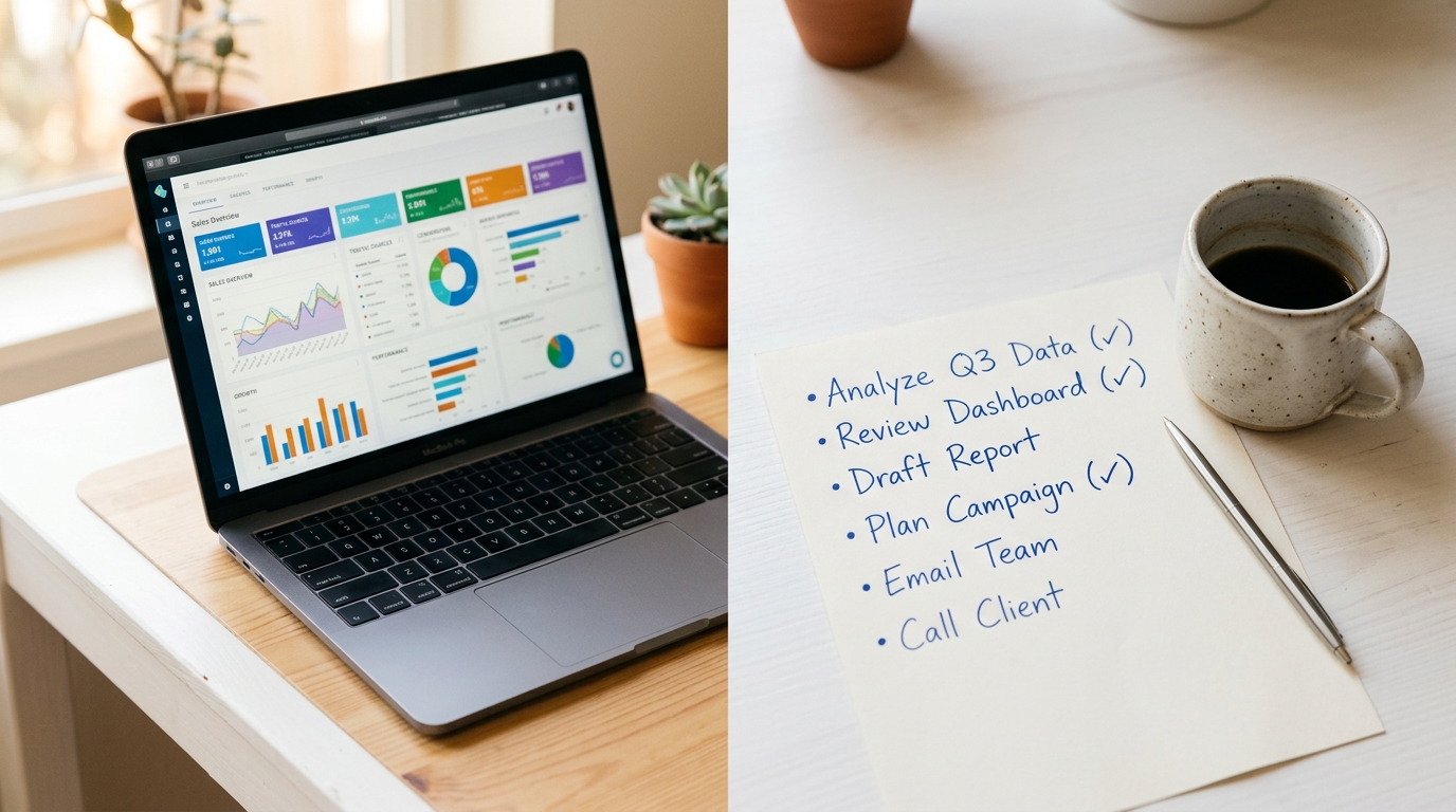
You need to know if this works. In Google Analytics (or whatever you use), set up one goal: did they click the button? That's it. Not scroll depth. Not time on page. Not heat maps. Did they click the button, yes or no.
Give it two weeks. Compare to your old layout. If clicks went up, you're done. If they didn't, change the headline and test again. This isn't rocket surgery - it's just paying attention to one number.
If you want to go further, a good marketing suite with QR tracking can show you which specific campaigns are driving traffic to your landing page. Useful for knowing whether that Instagram ad or that flyer at the coffee shop is actually pulling its weight.
Why the Boring Pattern Wins
Look. I build websites for small businesses. I've been doing this for over twenty years. And every single time I test a 'creative' above-the-fold layout against this boring one, the boring one wins. Not by a little. By a lot.
The parallax scrolling thing? Visitors find it disorienting. The full-screen video background? Takes six seconds to load on mobile and autoplays someone talking while they're in a waiting room with no headphones. The animated gradient? Cool for a portfolio site, confusing for a plumber's homepage.
The businesses that convert - the wedding photographers getting booked out three months ahead, the HVAC companies with full schedules, the taco trucks with catering waitlists - they all use some version of this same boring, clear, 'here's what we do and here's how to hire us' layout.
I've built a few dozen of these at autom84you.com/pages/portfolio.php if you want to see what they look like in the wild. Different industries, same core pattern, all converting.
What to Do Next
You've got your above-the-fold section. Now leave it alone for two weeks and watch your analytics. Resist the urge to tweak it after three days. Data needs time.
After two weeks, if conversions are up: move on to fixing the rest of the page below the fold. If they're flat: change your headline (not the layout) and test again.
And if you're staring at all of this thinking 'I'd rather just pay someone who's done this a hundred times' - fair. That's literally what I do. Custom landing pages, full sites, the whole thing. Shoot me a note at nerd@a84y.com or check out autom84you.com. I'll tell you honestly if your current page just needs a headline swap or a full rebuild. No pitch, just a straight answer from someone who's seen a lot of above-the-fold sections in his life. Probably too many.


Comments
No comments yet. Be the first to share your thoughts!
Leave a Comment